How to Describe an Image for SEO and Accessibility
Learn how to describe an image the right way for SEO and accessibility, with alt text tips, examples, and AI tools to speed up the process.
You're staring at the CMS, the image is already uploaded, and the alt text box is blinking like it has opinions. The photo makes sense in your head, but the second you try to describe it for a screen reader, search, or a reader skimming on mobile, the words get slippery.
That's usually the core problem with describe an image work. It's not that writers don't know what the picture shows, it's that they're trying to solve three jobs at once without a clean workflow: accessibility, context, and search visibility. The fix is less mystical than it sounds, but it does require knowing which kind of description you need before you type.
The Moment You Realize You Have No Idea What to Write
The hardest image descriptions are rarely the dramatic ones. They're the plain ones, a team photo, a product shot, a screenshot, a chart with tiny labels, the kind of visual that looks obvious until you need to explain it to someone who can't see it. That's when the blank field starts feeling personal.
What the description is really doing
A useful image description gives different readers the same mental picture for different reasons. A screen reader user needs the important content, a hurried reader needs the point fast, and a search engine needs enough context to understand what the image is about. Those goals overlap, but they're not identical.
The cleanest way to think about it is to split the job into alt text, caption, and longer image description. Alt text is usually attached to the image itself, captions are visible and can carry context, and longer descriptions are where charts, screenshots, and dense visuals get the room they need. If you've ever wondered why one image needs five words and another needs a full paragraph, that's the reason.
Practical rule: if the image adds information, describe the information. If it only repeats the page, don't make it do extra work.
This is also where people overcomplicate things. They try to make every image sound polished, but accessibility doesn't care about prose style first. It cares about whether someone who can't see the image still gets what matters.
A good mental shortcut is simple, write for the purpose of the image, not the picture itself. A hero banner, a chart, and a decorative divider are doing different jobs, so they should not get the same kind of text.
The Four-Part Structure That Makes Descriptions Click

The easiest reliable framework is subject, action, setting, details. It sounds almost too tidy, but it holds up when the image is simple enough to fit in a sentence and when it's messy enough to need a little more structure. That stepwise shape also matches accessibility guidance that starts broad and gets specific only after the reader has a mental model of the image. and the both reflect that logic in different ways.
A rewrite that shows the difference
Take a product photo of a blue running shoe on a white background.
Bad: shoe
Better: Blue running shoe on a white background
Better still: Blue running shoe angled left on a white background, with a mesh upper and white sole
The first version identifies the image but does almost nothing else. The second version gives the subject and setting. The third adds the details that matter if someone needs to picture the product or compare it with another one. That's the point of the structure, not literary elegance, just enough precision to be useful.
The same pattern scales to more complex images. A photo of a speaker at a conference might start with the person, then the action, then the stage or room, then the visible details that matter, like a microphone or slide screen. A chart needs the chart type, the trend or comparison, the axes or labels that matter, and the key takeaway. In a screenshot, the visible text may matter more than the layout.
Start with what the image is, then what it's doing, then where it is, then the detail that changes meaning.
If you're trying to improve your paragraph flow around image descriptions too, helps with the same discipline, short, clear, and ordered by importance.
Picking the Right Format for the Image in Front of You

Not every image deserves a full paragraph, and not every image can survive on a tiny alt string. The mistake teams often make is treating every asset the same. A logo, a chart, a meme, and a screenshot of a dashboard all need different treatment, even if they sit side by side in the same article.
The quick decision rule
If the image is simple or decorative, short alt text is usually enough. If it carries information, needs explanation, or contains text, it needs more than a bare label. That's why a product thumbnail might only need a concise identifier, while a chart or screenshot often needs a fuller description or caption. Microsoft's image-description handout says most brief descriptions are about 15 to 25 words, and JMU's guidance says alt text should usually stay under 125 characters when possible, which is a good reminder not to turn every thumbnail into a novella.
Product photos are a good example. If the image is one shoe on a plain background, short alt text works because the surrounding product page can carry the rest. If the image shows the shoe in use, you may need a little more context because the image is no longer just identifying an item, it's showing fit, style, or use case.
Screenshots are different. If they contain interface text, labels, or navigation state, the visible words matter and the description has to include them when relevant. That's where people often underwrite the image and leave out the part that changes the meaning.
When the caption earns its keep
A visible caption is useful when the image needs public explanation, not just accessibility support. Charts, editorial photos, and complex graphics often benefit from a caption because the caption can do more interpretive work while alt text stays concise and functional.
If you need a practical example of a workflow around image cleanup before adding descriptions, is useful for product and marketing images before you write the final text.
The rule of thumb is boring in the best way. Simple image, short alt text. Informational image, fuller description. Text-heavy image, transcribe what matters.
Common Mistakes That Quietly Hurt Your SEO and Accessibility
The most common errors are rarely dramatic. They're the little things that make a screen reader sound clumsy or make a search engine miss the point. They also show up everywhere in content audits, which is why they're worth fixing before you publish another post.
Keyword stuffing sounds optimized and reads terrible
A lot of people still write alt text like they're stuffing a footer with SEO phrases. That usually gives you something like, red sneakers running shoes athletic shoes buy running shoes best shoes for runners, which helps nobody and sounds suspicious to everyone.
A better version is just enough to identify the image and its function, like Red running shoes photographed on a studio background. If the image is a link or product card, the description should also make the destination or purpose clear. That lines up with the alt-text reasoning described by , which emphasizes context and purpose over pure label matching.
Decorative images need restraint, not fake importance
When an image is purely decorative, giving it a noisy description can create clutter for screen reader users. A divider graphic that says “ornamental flourish on a beige background” is not helping anyone if the page already communicates the idea in text.
The fix is simple, leave decorative images empty where the platform allows or mark them as non-essential in the way your CMS supports. Don't force meaning into an asset that exists for layout. Accessibility gets worse, not better, when every border icon is treated like a documentary subject.
Text inside images should be transcribed
If text appears in the image, it needs to be preserved, not guessed. That's especially true for screenshots, charts, posters, and infographics. The guidance from says to transcribe the text in the image, and Harvard's guidance says to include text only when it's needed for understanding the image.
Bad: Screenshot of a dashboard showing performance metrics
Better: Screenshot of a dashboard with the label “Weekly performance,” a line chart, and the note “Updated on Monday”
If the text changes meaning, paraphrasing it can break the image. If the image contains labels, numbers, or a headline, those aren't decorative flourishes. They're content.
The fastest way to ruin useful image text is to summarize what should have been copied.
Where AI Image Descriptions Help and Where They Mislead
AI is excellent at getting you unstuck. It is not excellent at being trusted without review. That's the whole story, and the gap between those two things is where teams either save time or create cleanup work later.

What AI drafts well
AI can give you a useful first pass, especially when the image is visually straightforward. It's good at structure, it can suggest a clean subject-action-context sequence, and it can help when you're staring at ten screenshots and your brain has already left for the day.
That said, research keeps showing the same pattern. A 2024 study evaluating alternative texts for STEM images found that none of the analyzed systems were mature enough to replace human preparation of alt text, and other research found that people still preferred human-authored descriptions even when machine-generated outputs were accurate. The older Twitter study also found that fewer than 0.1% of original image tweets included any user-provided image description, which is a good reminder that adoption was historically low long before AI entered the picture.
What humans still catch faster
Humans catch context. They know when the picture is ironic, when a screenshot is from a staging account, when a chart label matters more than the trend line, and when the image is there to support a joke rather than inform the reader. AI can miss all of that while still sounding confident, which is a nasty combo.
That's why the best workflow is hybrid. Let AI draft, let the human choose what matters, and let the human decide whether the image should be described as alt text, caption, or both. Context-aware systems are improving, especially when they combine webpage text, titles, URLs, and image content, but the current evidence still supports human oversight as the dependable standard.
For image interpretation inside a prompt workflow, is useful because it treats image reading as a drafting aid rather than a final authority.
If you're doing thumbnail work too, because composition and text legibility affect how you think about the image before you ever write the description.
A Practical Workflow Using Zemith to Speed Things Up
A rough AI draft is enough here. I use it to get the first pass down, then I rewrite for page context, image type, and the job the text has to do. Zemith fits that workflow well because it helps draft, compare, and refine image text without forcing a blank-page start.
A simple workflow that works
Upload the image, ask for a plain description first, then ask for a second version aimed specifically at alt text. If the image is a chart, ask for the main trend and the labels that matter. If it is a screenshot, ask for the visible text to be preserved verbatim and the interface state to be summarized in one line.
Try prompts like these:
- Product shot: “Describe this product image for alt text. Keep it concise, objective, and focused on the main subject.”
- Chart: “Describe this chart in a way that a screen reader user can understand the data trend, labels, and takeaway.”
- AI-generated image: “Describe the framing, orientation, style, and main subjects. Call out anything that looks synthetic or composited.”
- Screenshot: “Transcribe all visible text and summarize the interface state in one short accessibility-friendly description.”
For a broader prompt approach, helps separate visual reading from final wording, which matters when you are turning the same asset into alt text, a caption, or a reusable prompt.
The workflow works because it separates drafting from judgment. You are not asking the model to decide importance on its own. You are using it to surface the details you can then edit for purpose and tone.
Where the tool saves time
Zemith's multi-model access makes it easier to compare drafts when one model over-describes and another misses the obvious. Its image analysis and image-to-prompt tools also fit the same task, taking a visual input and turning it into text you can reshape for accessibility, captions, or reuse in creative workflows. That matters when you are working through a backlog of blog images, product shots, AI-generated visuals, or chart descriptions and need a fast first draft without accepting the first draft as final.
The best use case is editorial triage. Let the tool get you from blank page to usable draft, then edit for accuracy, redundancy, and the actual intent of the image. That keeps you in control of the final wording, which is where accessibility quality really lives.
A Pin-to-Your-Wall Description Checklist

Good image descriptions get easier when you stop improvising and start checking the same few things every time. That's especially true in CMS workflows, where speed pressure usually creates the worst alt text, the rushed one that technically exists but doesn't help anyone.
The checklist I'd use before hitting publish
- Does it pass the squint test? If someone can't see the image, the description should still tell them what matters.
- Is it short enough for the job? Keep simple alt text concise, and don't force a long description into a tiny field.
- Does it describe content, not style? “Minimalist photo” is not the same as “two people speaking at a conference table.”
- Does it avoid filler? Skip phrases like “image of” or “picture of” unless your platform or workflow needs them.
- Would it still work without the page in front of you? If the description only makes sense because the surrounding copy explains it, it probably needs a rewrite.
- Does it add context the surrounding text doesn't already give? If it repeats the paragraph above it, that's a wasted opportunity.
These checks line up well with the broader guidance from , because image text works better when the asset and the content around it are organized together instead of treated as separate chores.
The main habit to build is consistency. A description doesn't need to be clever, it needs to be usable. If you can review each image through the same checklist, you'll stop treating alt text like a last-minute cleanup task and start treating it like part of the content itself.
If you want a faster way to draft and compare image descriptions without losing the human edit that makes them work, try . It gives you a place to turn images into usable text, refine that text for alt text or captions, and keep the workflow moving without handing accessibility over to guesswork.
Explore Zemith Features
Everything you need. Nothing you don't.
One subscription replaces five. Every top AI model, every creative tool, and every productivity feature, in one focused workspace.
Every top AI. One subscription.
ChatGPT, Claude, Gemini, DeepSeek, Grok & 25+ more







Always on, real-time AI.
Voice + screen share · instant answers
What's the best way to learn a new language?
Immersion and spaced repetition work best. Try consuming media in your target language daily.
Voice + screen share · AI answers in real time
Image Generation
Flux, Nano Banana, Ideogram, Recraft + more

Write at the speed of thought.
AI autocomplete, rewrite & expand on command
Any document. Any format.
PDF, URL, or YouTube → chat, quiz, podcast & more
Video Creation
Veo, Kling, Grok Imagine and more

Text to Speech
Natural AI voices, 30+ languages
Code Generation
Write, debug & explain code
Chat with Documents
Upload PDFs, analyze content
Your AI, in your pocket.
Full access on iOS & Android · synced everywhere
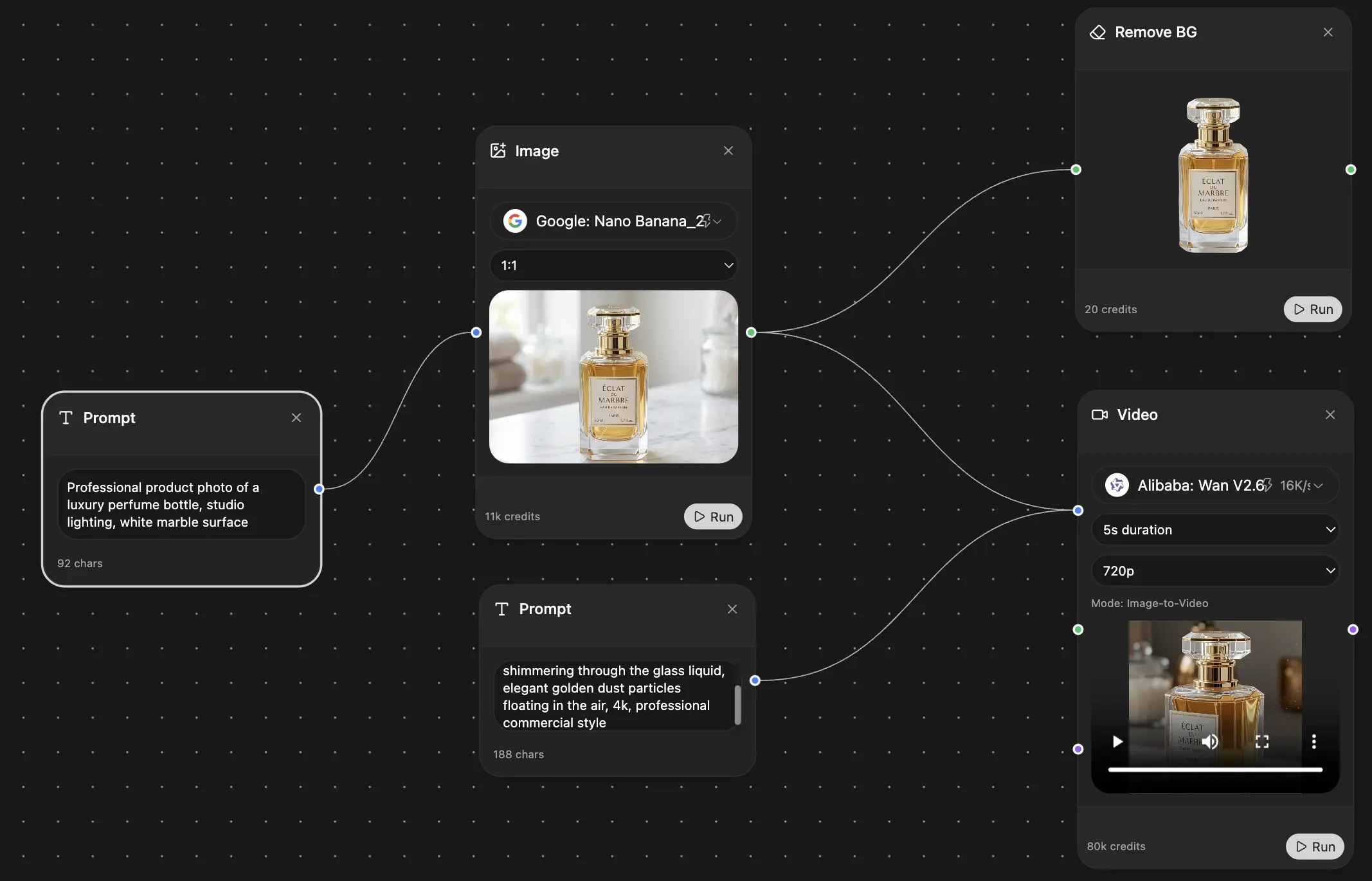
Your infinite AI canvas.
Chat, image, video & motion tools — side by side
Save hours of work and research
Transparent, High-Value Pricing
Trusted by teams at
Free
No credit card required
- 100 credits daily
- 3 AI models to try
- Basic AI chat
Plus
- 1,000,000 credits/month
- 25+ AI models — GPT, Claude, Gemini, Grok & more
- Agent Mode with web search, computer tools and more
- Creative Studio: image generation and video generation
- Project Library: chat with document, website and youtube, podcast generation, flashcards, reports and more
- Workflow Studio and FocusOS
Professional
- Everything in Plus, and:
- 2,100,000 credits/month
- Pro-exclusive models (Claude Opus, Grok 4, Sonar Pro)
- Motion Tools & Max Mode
- First access to latest features
- Access to additional offers
What Our Users Say
Great Tool after 2 months usage
simplyzubair
I love the way multiple tools they integrated in one platform. So far it is going in right dorection adding more tools.
Best in Kind!
barefootmedicine
This is another game-change. have used software that kind of offers similar features, but the quality of the data I'm getting back and the sheer speed of the responses is outstanding. I use this app ...
simply awesome
MarianZ
I just tried it - didnt wanna stay with it, because there is so much like that out there. But it convinced me, because: - the discord-channel is very response and fast - the number of models are quite...
A Surprisingly Comprehensive and Engaging Experience
bruno.battocletti
Zemith is not just another app; it's a surprisingly comprehensive platform that feels like a toolbox filled with unexpected delights. From the moment you launch it, you're greeted with a clean and int...
Great for Document Analysis
yerch82
Just works. Simple to use and great for working with documents and make summaries. Money well spend in my opinion.
Great AI site with lots of features and accessible llm's
sumore
what I find most useful in this site is the organization of the features. it's better that all the other site I have so far and even better than chatgpt themselves.
Excellent Tool
AlphaLeaf
Zemith claims to be an all-in-one platform, and after using it, I can confirm that it lives up to that claim. It not only has all the necessary functions, but the UI is also well-designed and very eas...
A well-rounded platform with solid LLMs, extra functionality
SlothMachine
Hey team Zemith! First off: I don't often write these reviews. I should do better, especially with tools that really put their heart and soul into their platform.
This is the best tool I've ever used. Updates are made almost daily, and the feedback process is very fast.
reu0691
This is the best AI tool I've used so far. Updates are made almost daily, and the feedback process is incredibly fast. Just looking at the changelogs, you can see how consistently the developers have ...