Master Data Analysis Techniques: A 2026 Guide
Master essential data analysis techniques. Learn descriptive, predictive & prescriptive methods. Choose the right one & streamline workflow with AI in 2026.
You've got a spreadsheet open, three browser tabs full of dashboards, a folder of customer comments, and one Slack message asking, “Can you pull a few insights by end of day?” That's usually the moment people realize they don't have a data problem. They have a decision problem.
Teams aren't short on data. They're short on a repeatable way to turn raw inputs into something useful. Numbers pile up. Notes pile up. PDFs pile up. Then someone tries to rescue the whole mess with a chart that looks impressive but answers nothing. If your data isn't clean, you're just making fancy garbage.
A lot of guides on data analysis techniques go to one of two extremes. They either read like a statistics textbook written by a very tired professor, or they give you fluffy advice like “look for trends” and call it a day. Neither helps when you're staring at messy exports and trying to decide what to do next.
Good analysis is less about sounding smart and more about asking the right question in the right order. Sometimes a simple chart does the job. Sometimes you need regression. Sometimes the gold is buried in interview transcripts, support tickets, or web data, and a clean table doesn't even exist yet. If you work with scraped sources or public datasets, give a helpful overview of what web data is and why it matters. And if your bigger issue is mental overload, this guide on is worth a read before you touch a single dataset.
Drowning in Data Lets Build a Raft
The first mistake junior analysts make is treating all data like it's ready for analysis. It isn't. A CRM export, a website analytics report, and a pile of survey comments are three different species. Trying to process them with one generic method is like bringing a butter knife to fix a bike chain.
What overwhelm usually looks like
You'll recognize the pattern:
- Too many sources: Sales data lives in one tool, product usage in another, and customer feedback in a shared drive named “Final_Final_UseThisOne.”
- No clear question: People ask for “insights” when they really want a recommendation.
- Messy inputs: Missing fields, duplicate rows, inconsistent labels, and text feedback with no structure.
- False urgency: Somebody wants an answer today, even though the dataset clearly needs cleanup first.
That pressure makes people jump straight into charts or modeling. Bad move. Analysis without a question is wandering. Analysis without clean data is theater.
Practical rule: Start by writing one sentence that finishes this phrase: “We need to decide whether…”
That sentence changes everything. “We need to decide whether paid search is driving qualified leads.” Great. Now you know what to collect, what to ignore, and what kind of technique fits.
The raft is a workflow
A useful analysis process feels less like magic and more like a checklist. You gather the right data, clean it, explore it, test ideas, visualize the results, and only then make a recommendation. That order matters. Skip steps and confusion multiplies.
There's also a mindset shift here. You don't need to be a math genius to use data analysis techniques well. You need judgment. You need to know when a median is more honest than an average, when a bar chart is better than a pie chart, and when a comment from a customer tells you more than a dashboard ever could.
The goal isn't to become a walking encyclopedia of algorithms. The goal is to get from “we have a mess” to “here's what we should do next.”
The Five Flavors of Data Analysis
A clean way to understand data analysis techniques is to think like a detective. You arrive at the scene with evidence in front of you. Different questions call for different kinds of investigation.

Descriptive and diagnostic
Descriptive analysis answers the simplest question: what happened?
This is the detective walking through the room and noting the obvious facts. Sales fell. Traffic rose. Refunds increased. It summarizes past events.
Diagnostic analysis asks why did it happen? Now the detective starts checking for causes. Did refunds climb after a shipping delay? Did conversion rates drop after a landing page redesign? Comparisons, breakdowns, and tests then become important.
A quick mental model helps:
Exploratory, predictive, and prescriptive
Exploratory analysis is more open-ended. It asks, what patterns or relationships are hiding here? You don't always begin with a fixed hypothesis. You look around, test assumptions, and see what stands out. This matters a lot when the dataset is unfamiliar or messy.
For qualitative work, exploratory analysis often overlaps with coding and theme-finding. Researchers systematically read and re-read material, flag recurring concepts, and group them into larger themes. That coding process is the backbone of qualitative analysis, and this guide to lays it out clearly.
Predictive analysis asks, what is likely to happen next?
This is your forecast. It uses historical patterns to estimate future outcomes. Think churn risk, likely demand, or expected lead quality.
Prescriptive analysis asks, what should we do about it?
This is the detective who doesn't just identify the suspect but recommends the next move. Increase spend on the channel with stronger lead quality. Change the onboarding step causing drop-off. Prioritize the product issue that shows up across support logs and reviews.
Analysis gets more valuable as it gets closer to action.
Why people mix these up
A common confusion is treating every analysis task like prediction. You don't always need a forecast. If a stakeholder asks why returns spiked last month, a predictive model is overkill. A few descriptive cuts, a diagnostic comparison, and a review of customer comments might solve it faster.
Another confusion is lumping exploratory and diagnostic work together. They're cousins, not twins. Exploratory work helps you discover possibilities. Diagnostic work helps you confirm likely causes.
That distinction saves time. It also keeps you from using a chainsaw when a screwdriver would do.
Your Data Analysis Toolkit Unpacked
A good toolkit does not make you a good analyst by itself. A good toolkit in the right order does.

The practical question is not “Which method sounds smartest?” It is “What job needs doing right now?” That shift matters because analysis is a workflow. You summarize first to get your bearings, test relationships when a decision depends on cause or influence, and simplify only when the dataset gets too messy to reason about clearly.
Tools for summarizing and seeing
Start simple. The first pass through a dataset should feel like walking into a room and turning on the lights.
Summary statistics give you that first orientation. Mean, median, range, and standard deviation help you answer basic but useful questions. What does “normal” look like here? Are a few giant values pulling the average upward? Is the data tightly grouped or all over the place? If you are reviewing salaries, basket sizes, or time on site, the median often gives a more honest read than the mean.
Visualization is your second flashlight. A histogram can show skew in seconds. A box plot can expose outliers before they adversely affect your averages. A line chart can reveal seasonality or breaks in the pattern that a table will hide all day.
This step looks easy because the tools are familiar. It is easy to do badly.
A chart should answer a question, not decorate a slide. Bar charts work well for category comparisons. Line charts work well for change over time. Color should guide attention, not create a carnival. If your audience has to squint and guess what matters, the chart is not finished. These are a good reference when you want cleaner, more readable outputs.
Tools for relationships and prediction
Once you know what the data looks like, you can ask a harder question. What seems connected to what?
Regression analysis helps estimate how one variable changes with another while holding other factors constant. That sounds academic, but the day-to-day use is straightforward. If conversion rate rises when response time falls, regression helps you estimate how much that relationship matters and whether it still holds after accounting for traffic source, device type, or campaign.
In predictive work, regression also gives you a baseline model to beat. That matters more than many junior analysts realize. You do not start with the fanciest method. You start with the clearest one, then improve from there if the extra complexity earns its keep. The gives a useful overview of how these methods are used in practice.
Then there is feature engineering, which is a fancy label for prep work that makes patterns easier for a model to detect. Raw data is like ingredients on a counter. A model can work with them, but it usually works better after you chop, sort, and season a bit. Log transformations can calm extreme skew. Time-based features such as day of week or time since last purchase can expose behavior patterns that a raw timestamp hides. Interaction terms can capture cases where two variables matter more together than they do alone.
Done well, feature engineering often improves model quality more than switching algorithms. Analysts and ML teams commonly use these tactics because cleaner, better-shaped inputs can raise measures such as AUC over a plain baseline model, as noted in the .
If your data is not clean, you are just making fancy garbage.
Tools for grouping, classifying, and simplifying
Some problems are less about prediction and more about structure. You are trying to find the shape of the mess.
- Clustering groups similar records when you do not already have labels. Useful for customer segments, product groupings, or behavior patterns you have not named yet.
- Classification assigns records to known categories. Fraud or not fraud. Likely to churn or likely to stay.
- Dimensionality reduction cuts down the number of variables while keeping as much signal as possible. This helps when you have dozens or hundreds of features and need something humans can still inspect.
- Time-series analysis handles data where order matters. Yesterday comes before today for a reason.
- NLP techniques help with text-heavy data such as surveys, reviews, support tickets, and call transcripts.
The common trap is choosing a method because it sounds advanced in a meeting. Resist that urge. Clustering is not better than a pivot table if the real question is just “Which region dropped last quarter?” PCA is not a badge of honor if three well-chosen variables already explain the pattern.
Good analysis often looks boring before it looks impressive.
For teams dealing with spreadsheets, documents, notes, and messy source files before analysis even starts, solid save time and reduce avoidable mistakes. Tools like Zemith help here because they speed up the repetitive parts, organize context, and let you move from raw inputs to usable analysis without so much manual wrangling.
Good analysts do not collect techniques like trophies. They choose the simplest method that answers the question well.
How to Choose the Right Technique
Most analysis mistakes happen before the analysis starts. Not because the math is hard, but because the question is fuzzy. If you choose data analysis techniques by vibe, you'll waste hours and still end up with a dashboard nobody trusts.

Start with the business decision
The best selection framework begins with one thing: what decision needs to be made?
Not “what data do we have?”
Not “what tool should we use?”
Not “can we run a model?”
The true starting point is the decision.
If the decision is about understanding recent performance, descriptive or diagnostic work usually wins. If the decision is about future risk or demand, predictive techniques make more sense. If the decision is about how to act, then prescriptive thinking matters.
This sounds obvious, but it's where teams drift. People often grab the most complex-looking method and work backward. That's how you end up with a machine learning model answering a question a bar chart could've solved before lunch.
Match the technique to the data you actually have
Your method also has to respect your data's shape.
That mixed case is where many teams get stuck. They've got metrics in one place and comments in another, and they can't connect the two cleanly. A better path is to combine quantitative evidence with qualitative interpretation instead of forcing everything into one rigid format. This is the heart of , and it's one of the biggest differences between “interesting analysis” and “useful analysis.”
Use a decision path, not guesswork
A simple decision path helps:
- Define the question clearly. What are you trying to explain, predict, or improve?
- Inspect the data type. Numeric, categorical, text-based, time-based, or mixed?
- Check data quality. Missing values, duplicates, inconsistent labels, weak sampling.
- Choose the lightest method that can answer the question. Start simple.
- Test, review, refine. If the result isn't actionable, the method may be wrong.
That fourth step matters a lot. Analysts often think “advanced” means “better.” It doesn't. Advanced methods can fail beautifully if the question is bad or the data is weak.
The right technique is the one that gets you to a defensible decision with the least unnecessary complexity.
If you want a practical habit to build, ask this before every project: “What would count as a useful answer?” If you can't answer that, don't open Python yet.
From Raw Data to Aha A Step by Step Workflow
Technique choice matters, but workflow is what gets results. Most stalled projects don't fail because the team lacked intelligence. They fail because nobody moved cleanly from collection to cleaning to analysis to communication.
The useful version of analysis follows a strict five-step workflow: Collect Data, Clean Data, Analyze Data, Visualize Data, and Generate Insights. An actionable insight isn't just an interesting pattern. It's information that leads to a specific, practical action to improve the business ().

Step one and two are less glamorous and more important
Collect data from reliable sources. That could mean databases, exported CSVs, APIs, internal reports, survey tools, or document archives. Sometimes the data arrives in annoying formats, especially PDFs. If you've ever had to wrangle financial records from static files, is a practical resource for getting bank statement PDFs into Excel before the main analysis begins.
Then comes cleaning, which is where optimism goes to fight for its life.
Here's the usual checklist:
- Remove duplicates: Duplicate rows can inflate counts and wreck trust fast.
- Handle missing values: Decide whether to fill, exclude, or flag them.
- Standardize categories: “NY,” “New York,” and “new york” should not be three separate realities.
- Check date fields: Broken dates can undermine time-based analysis.
- Spot obvious outliers: Some are real. Some are keyboard accidents.
If your data isn't clean, you're not doing analysis. You're decorating errors.
Step three and four turn structure into understanding
Analyze data using the technique that matches the question. Your earlier decision framework now demonstrates its value. Sometimes that means summary stats. Sometimes regression. Sometimes coding themes across text. Sometimes a blend.
A quick visual walk-through helps:
After analysis, visualize the results. This is not the same as making them pretty. A useful chart reduces cognitive load. It helps someone understand the finding fast enough to act on it.
Try this rule set:
A chart without a stated takeaway is a puzzle. Executives do not want puzzles.
For a stronger habit around first-pass inspection and trend spotting, keep this guide to in your rotation.
Step five is where insight becomes action
The final step is generate insights. This is the most human part of the process. You interpret the results, connect them to business context, and recommend something specific.
Weak insight: “Users from mobile convert differently.”
Actionable insight: “Mobile users drop off on the pricing page, so test a shorter layout and simplify plan comparison.”
That difference is everything.
A lot of people stop at observation because interpretation feels risky. But if you've done the previous steps carefully, a recommendation isn't reckless. It's the point.
Real World Examples and AI Shortcuts
Monday morning. Slack is noisy, the dashboard looks dramatic, and someone wants an answer before lunch. This is the part of data analysis people care about. Which technique fits the problem, what decisions does it support, and how do you get to a useful answer without drowning in tabs?
That practical gap is where a lot of guides fall apart. They either hand you theory with no workflow, or they throw screenshots at you with no reasoning. Real analysis sits in the middle. You pick a method based on the decision in front of you, then use tools, including AI, to speed up the boring parts without outsourcing your judgment.
Example one for marketers using regression
Say you manage campaigns across search, email, and social, and the team keeps debating which channel influences sales. Regression is a sensible starting point because you want to estimate how several inputs relate to one outcome.
A very simple Python sketch might look like this:
data = pd.DataFrame({ "search_spend": [1200, 1500, 1100, 1800], "email_clicks": [300, 420, 280, 500], "social_spend": [800, 900, 700, 1000], "sales": [15000, 18000, 14500, 21000] })
X = data[["search_spend", "email_clicks", "social_spend"]] y = data["sales"]
model = LinearRegression() model.fit(X, y)
print(model.coef_) print(model.intercept_)
The code is the easy part. The hard part is deciding what question you are actually asking.
Are you trying to explain past sales, forecast next month, or defend budget allocation to leadership? Those are related, but they are not identical. A junior analyst often runs the model first and asks the business question second. Reverse that order. It saves pain.
Once the model runs, inspect the coefficients, check whether the relationships make business sense, and test the assumptions. If your data isn't clean, you're just making fancy garbage. And if the variables move together too tightly, your regression can act like three people trying to steer one shopping cart.
If your work centers on product and website patterns, this primer on gives helpful context for how behavioral signals can support deeper analysis.
AI helps here by handling setup work faster. It can draft starter code, suggest variables to test, summarize model output in plain English, and flag obvious issues to review. Zemith is especially useful for compressing that first pass. You still need to decide whether the result is believable and actionable, but you get to spend more time on that higher-value judgment.
Example two for researchers with qualitative data
Now switch to a harder mess. You have interview transcripts, support tickets, survey comments, or app store reviews. The challenge is not a lack of data. The challenge is turning messy language into a pattern you can defend.
Many tutorials get awkward regarding certain topics. They explain clustering, regression, and forecasting well enough, then treat qualitative analysis like an arts-and-crafts project. In real work, you need a repeatable workflow that preserves nuance and still leads to decisions.
A practical process looks like this:
- Read for recurring concepts. What problems, goals, or emotions keep showing up?
- Code the material. Tag ideas such as pricing confusion, onboarding friction, trust concerns, or slow support.
- Group codes into themes. Those themes become the storylines you can report on.
- Count where it helps. Frequency adds structure, but counts alone are not the point.
- Pull representative quotes. Quotes keep the analysis honest and concrete.
- Map themes to actions. "Users feel frustrated" is vague. "New users get stuck during account setup because the verification step is unclear" is useful.
Qualitative analysis is structured interpretation with evidence.
If you want outside reading on early pattern finding, DASCA's guide to mastering exploratory data analysis is one reference practitioners often review: .
AI can save a huge amount of time in this workflow. It can cluster similar comments, suggest draft codes, summarize repeated complaints, and compare themes across interviews. That speeds up the first read. It does not replace the analyst, because someone still has to catch sarcasm, context, contradictions, and the occasional respondent who answers every question like they are writing poetry after no sleep.
The pattern is the core lesson in both examples. Use the technique that fits the decision. Let AI handle the repetitive setup and sorting. Keep human judgment in charge of interpretation. That combination gets you from raw inputs to a recommendation faster, and tools like Zemith make that process a lot less chaotic.
Common Pitfalls and Your AI Powerhouse
A lot of analysis goes wrong long before anyone opens Python, SQL, or a dashboard. The primary failure point is usually judgment. A team starts with a fuzzy question, grabs messy data, spots a pattern they hoped to find, and wraps it in a chart that looks convincing enough to survive a meeting.
That is how weak conclusions get dressed up as insight.
Here are the traps that cause the most damage in day to day work:
- Confirmation bias: You start with a belief and treat the analysis like a scavenger hunt for supporting evidence.
- Correlation versus causation: Two variables rise together, and someone rushes to claim one caused the other.
- Ignoring data quality: Missing values, duplicates, inconsistent labels, and bad joins contaminate everything that follows.
- Overcomplicating the method: A fancy model can make a bad assumption harder to spot.
- Tool fatigue: Your files are in one place, notes in another, charts in a third, and your draft somewhere else. The work slows down because your brain keeps paying a context-switch tax.
That last problem gets underestimated.
Analysis is part logic, part memory, part attention management. If you spend your day hopping between tabs just to reconstruct what you were doing, you are not doing more analysis. You are doing more recovery work. It is like trying to cook dinner while the ingredients are stored in five different apartments.
Good analysts build habits that look simple from the outside. They start by pinning down the decision. They check whether the data is trustworthy enough for that decision. They choose the simplest method that can answer the question. Then they pressure test the result before turning it into a recommendation.
Boring wins more often than brilliant.
AI fits best in the parts of the workflow that are repetitive, messy, or slow. It can summarize source material, organize notes, draft code, compare documents, and help rewrite findings for different audiences. The future of analysis isn't just more methods. It is faster movement from question to answer, with fewer dropped threads and less manual glue work between steps.
The catch is that AI does not rescue weak thinking. If your data isn't clean, you're just making fancy garbage. If the question is vague, AI helps you produce vague output faster. Human judgment still decides what to trust, what to test, and what to recommend.
That is why the best setup is not "AI does the analysis for me." It is "AI handles the friction so I can spend more time doing analysis."
If you want one place to research, organize files, analyze documents, draft findings, and move from messy inputs to usable insights faster, try . It is the kind of workspace that helps you keep the whole workflow in view instead of juggling tools and losing the plot halfway through.
Explore Zemith Features
Everything you need. Nothing you don't.
One subscription replaces five. Every top AI model, every creative tool, and every productivity feature, in one focused workspace.
Every top AI. One subscription.
ChatGPT, Claude, Gemini, DeepSeek, Grok & 25+ more








Always on, real-time AI.
Voice + screen share · instant answers
What's the best way to learn a new language?
Immersion and spaced repetition work best. Try consuming media in your target language daily.
Voice + screen share · AI answers in real time
Image Generation
Flux, Nano Banana, Ideogram, Recraft + more

Write at the speed of thought.
AI autocomplete, rewrite & expand on command
Any document. Any format.
PDF, URL, or YouTube → chat, quiz, podcast & more
Video Creation
Veo, Kling, Grok Imagine and more

Text to Speech
Natural AI voices, 30+ languages
Code Generation
Write, debug & explain code
Chat with Documents
Upload PDFs, analyze content
Your AI, in your pocket.
Full access on iOS & Android · synced everywhere
Your infinite AI canvas.
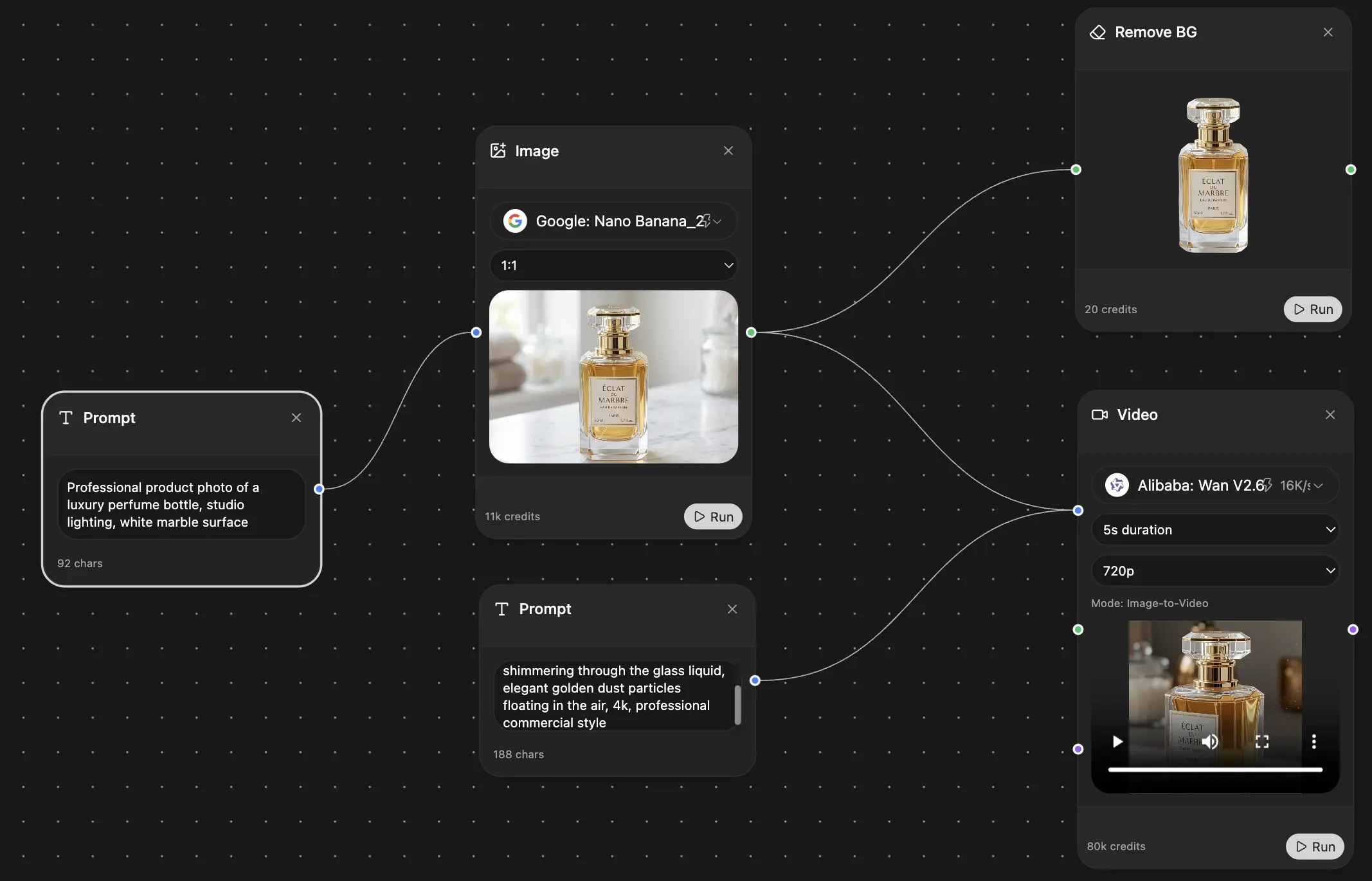
Chat, image, video & motion tools — side by side
Save hours of work and research
Transparent, High-Value Pricing
Trusted by teams at






Free
No credit card required
- 100 credits daily
- 3 AI models to try
- Basic AI chat
Plus
- 1,000,000 credits/month
- 25+ AI models — GPT, Claude, Gemini, Grok & more
- Agent Mode with web search, computer tools and more
- Creative Studio: image generation and video generation
- Project Library: chat with document, website and youtube, podcast generation, flashcards, reports and more
- Workflow Studio and FocusOS
Professional
- Everything in Plus, and:
- 2,100,000 credits/month
- Pro-exclusive models (Claude Opus, Grok 4, Sonar Pro)
- Motion Tools & Max Mode
- First access to latest features
- Access to additional offers
What Our Users Say
Great Tool after 2 months usage
simplyzubair
I love the way multiple tools they integrated in one platform. So far it is going in right dorection adding more tools.
Best in Kind!
barefootmedicine
This is another game-change. have used software that kind of offers similar features, but the quality of the data I'm getting back and the sheer speed of the responses is outstanding. I use this app ...
simply awesome
MarianZ
I just tried it - didnt wanna stay with it, because there is so much like that out there. But it convinced me, because: - the discord-channel is very response and fast - the number of models are quite...
A Surprisingly Comprehensive and Engaging Experience
bruno.battocletti
Zemith is not just another app; it's a surprisingly comprehensive platform that feels like a toolbox filled with unexpected delights. From the moment you launch it, you're greeted with a clean and int...
Great for Document Analysis
yerch82
Just works. Simple to use and great for working with documents and make summaries. Money well spend in my opinion.
Great AI site with lots of features and accessible llm's
sumore
what I find most useful in this site is the organization of the features. it's better that all the other site I have so far and even better than chatgpt themselves.
Excellent Tool
AlphaLeaf
Zemith claims to be an all-in-one platform, and after using it, I can confirm that it lives up to that claim. It not only has all the necessary functions, but the UI is also well-designed and very eas...
A well-rounded platform with solid LLMs, extra functionality
SlothMachine
Hey team Zemith! First off: I don't often write these reviews. I should do better, especially with tools that really put their heart and soul into their platform.
This is the best tool I've ever used. Updates are made almost daily, and the feedback process is very fast.
reu0691
This is the best AI tool I've used so far. Updates are made almost daily, and the feedback process is incredibly fast. Just looking at the changelogs, you can see how consistently the developers have ...