How to Rate a Photo Like a Pro Using AI and Human Review
Learn how to rate a photo with confidence using proven rubrics, technical metrics, and AI tools. A practical guide for creators, marketers, and developers.
You already know the feeling. The folder is packed with near-duplicates, one frame has perfect light but a weird expression, another nails the expression but the focus is soft, and suddenly the simple job to rate a photo turns into a tiny courtroom drama in your brain. That's where the process often goes wrong, they treat image selection like a vibe check instead of a repeatable system.
The better approach is part human judgment, part machine discipline. Photo rating has a real research history in computer vision and image aesthetics, not just in consumer apps, and that matters because it gives you a way to judge images consistently instead of emotionally. When a workflow is built well, it stops being “Do I like this one?” and starts being “Does this image meet the standard for this purpose?”
Why Most People Rate Photos the Wrong Way
A gallery full of near-duplicates tempts you to pick the frame that feels right in the moment. That works for a casual trip album where nobody cares if your choices shift with your mood. It breaks down fast in client galleries, product shoots, and creator backlogs, where the same decision has to hold up across hundreds of images and across different reviewers.
Gut feeling is fast, but not stable
Pure gut judgment changes with fatigue, screen size, context, and how long you have already spent staring at similar frames. Researchers have treated photo popularity and aesthetic assessment as measurable problems for years, not as random taste contests. In a 2014 study on image popularity, researchers analyzed about 2.3 million Flickr images and showed popularity could be predicted with a rank correlation of 0.81 when image content and social cues were combined, while even a simpler mean views baseline reached 0.75 in a one-per-user dataset, which is a strong reminder that scoring can be structured, not just subjective ().
That research history matters because it explains why a decent review system beats “this one feels right.” The point is not to strip out taste. The point is to make taste consistent enough that the same image gets the same result whether you are reviewing it alone, with a team, or inside an AI pipeline.
Practical rule: if two people cannot explain why one image won, your rating system is too loose.
A rating system is really a decision system
Strong workflows separate technical quality from aesthetic impact. That sounds obvious until you are inside a folder of wedding selects or ad creative and realize you are still rewarding a shot that is sharp but emotionally flat. A practical way to build this separation is to use a repeatable rubric for review, then tie that rubric to your broader process so the same standards apply from culling to delivery.
The shift is mental and operational. Instead of asking whether a photo is “good,” ask whether it is usable, on-brand, and strong enough for the intended audience. That is the difference between culling for yourself and culling for a business that needs reliable output. For side-by-side judgment, these help keep the comparison grounded in the frame, not the feeling.
A Two-Pass Workflow for Fast and Accurate Photo Culling
A strong culling session starts by clearing the obvious failures before anyone argues about taste. First remove the unusable files, then compare the survivors. That order matters in real folders, because the fastest way to waste time is to keep debating a frame that should never have reached the shortlist.
Pass one kills technical rejects
The first pass is a speed round. Review images in large view and move fast, about 1 to 2 seconds per image on the first pass, using the same technical triage many practitioner workflows recommend (). At this stage, remove anything with out-of-focus subjects, blown highlights, blocked shadows, camera shake, or unusable noise. If a frame fails basic capture quality, do not try to rescue it with optimism. The file may still matter for context, but it does not belong in the rating stack.
The rule is plain. If the image cannot clear the technical floor, it does not deserve a creative discussion. That keeps the rest of the session cleaner, because you are no longer comparing a usable portrait against a near-miss. You are comparing actual contenders.
Pass two ranks the survivors
The second pass is where you slow down and score what remains on composition, lighting, focus, exposure, and emotional impact. A practical benchmark from culling workflows is 3 to 5 seconds per image for this round, with only the strongest candidates getting 5 to 10 seconds of attention. In one professional-style workflow, the process reduces a shoot to about 20% after the first pass, around 5% to 4-star level, and roughly 1% to 5-star level. That is not magic, it is disciplined elimination and a clearer decision path.
If you need a second monitor for side-by-side review, compare on equal footing. A practical resource for can make the call less slippery when two frames look almost identical at a glance. This also fits cleanly into broader work, because faster review only helps if the standard stays consistent from batch to batch.
Do not spend ten minutes saving a mediocre frame when the next five candidates still need your attention.
A simple rating rhythm that works
A lot of editors get stuck because they keep reopening borderline images. That hidden tax slows the whole folder down. Use a hard rhythm instead, reject the failures, star the clear keepers, and leave the maybes alone until the end. The less time you spend rescuing average frames, the faster your strongest images surface.

Turning Technical Rules into a Photo Rating Rubric
A useful rubric starts with hard thresholds, not taste. In a real review queue, that matters because it lets the team decide what is acceptable, what is ideal, and what fails outright without arguing over every borderline frame. Platform rules are useful for that reason, they turn photo quality into something you can apply consistently in a workflow.
Objective limits give your rating system a backbone
Google's image guidance for Actions Center is a clear example. The minimum image size is 300×300 pixels, while Google recommends at least 1024×683 pixels and ideally 2048×1366 pixels in a 1:1 or 4:3 aspect ratio, with images that are sharp, in focus, well-exposed, and true-to-life (). That gives you a technical floor before aesthetics even enters the conversation.
Adobe Stock adds another practical layer. Contributor files must be JPEG, in sRGB, with a minimum resolution of 4 MP, a maximum of 100 MP, and a maximum file size of 45 MB (). Eezy Contributors require images to be at least 4 MP, no more than 50 MP, and no larger than 50 MB, with a unique English title and keywords and a model release for any commercial image with recognizable people ().
The point is not to copy every platform rule into one master checklist. The point is to borrow their logic, objective gates first, judgment second.
Build the rubric around what can be fixed
A strong rating rubric usually separates issues into three buckets:
- Automatic reject: files that fail technical compliance, usability, or platform rules.
- Fixable flaw: images that are salvageable with crop, exposure work, or metadata cleanup.
- Strong contender: images that already meet the floor and carry real visual impact.
That structure keeps the review explainable. It also stops teams from pretending that every flaw is equal. A slightly awkward crop can be corrected, but a file that misses basic resolution or licensing needs a different treatment.
Here's a quick comparison of how the rules translate into operational thresholds.
If you want a practical way to connect the rubric to image description and tagging, the workflow ideas in fit neatly here. They help turn a visual decision into a structured record instead of a vague label, which is useful when one reviewer's “usable” needs to match another reviewer's “keep.”
A rubric is only useful if people can apply it the same way twice.
Make the score explainable
The best rubrics do not just say “7/10.” They show why. A reviewer should be able to point to a sharpness issue, a composition strength, or a usage problem and justify the score without hand-waving. That matters even more when multiple people are rating the same batch and need a shared language.
For teams that want a broader scoring workflow, the practical notes in are a useful reminder that human review works best when the scoring criteria stay explicit. A score should tell you what failed, what passed, and what still needs attention, not hide the reasoning behind a single number.
One more operational check helps here. If a reviewer cannot explain why an image landed in a bucket, the bucket is too vague to trust.
Building an AI Pipeline to Rate Photos at Scale
AI works well when the task is repetitive, the dataset is large, and the scoring criteria are clear. It breaks down when you ask for one mysterious number and expect it to understand brand intent. Practical systems score several dimensions first, then merge those signals into a ranked shortlist that people can review fast.
Start with measurable features, not a beauty number
Research on image ranking points toward feature-based or model-based scoring rather than a single subjective label. One approach builds a score from measurable factors such as merger avoidance, rule of thirds, color harmonization, contrast, intensity balance, and blurriness, then learns the weights with ranking models such as ListNet (). That setup gives the system separate signals instead of one vague judgment.
A second composition pipeline shows how explicit the logic can be. It converts to grayscale, applies Gaussian blur to reduce noise, runs edge detection, detects lines with a Hough transform, and filters out lines with angles greater than 30 degrees when evaluating horizontal composition. More recent deep-learning auto-selection methods combine separate neural networks for general image quality, blur detection, and aesthetics, then merge them into a final score and ranking. The point is not that one method is perfect, it is that each method isolates a different failure mode before the final ranking happens.
That multi-signal approach is the right mental model. Do not ask one model to know everything. Ask several signals to do one job each, then compare the results against the same rubric.
Use Zemith as the working layer for model comparison
In practice, a multi-model workspace like Zemith can hold the review process together because it gives you one place to test outputs, compare responses, and structure your scoring prompts. Its image analysis tool can turn an uploaded image into a written description, which helps when you want the model to explain what it sees before it scores what it sees. The workflow notes in fit naturally here because they show how a description layer can sit between the image and the score.

A strong prompt asks for separate scores, not a single opinion. Ask for technical quality, blur, composition, and aesthetic appeal as distinct outputs, then compare those ratings across models. That makes disagreement useful instead of noisy, because you can see whether one model is reacting to clarity, balance, or subject matter.
Cross-check AI against the use case
Different uses need different ranking priorities. A product catalog image should be judged differently from a creator profile photo, and a social post should not be scored like a stock submission. A pipeline only earns trust when it compares model output against the intended purpose before anything gets approved.
The practical notes in are a good reminder that scoring changes with audience and use case. A workable system does not just score faster, it scores against the right target and leaves room for human review where the model is weak.
Where AI Photo Ratings Fail and Humans Still Win
AI is good at consistency. It's less good at knowing when consistency is the wrong goal. A technically clean image can still be the wrong image for a brand, a profile, or a social audience, because visual success depends on context as much as capture quality.
Technical quality isn't the same as audience response
The old mistake is assuming sharpness equals success. It doesn't. A photo can be perfectly exposed, evenly lit, and compositionally tidy, then still feel flat, awkward, or emotionally off for the audience you care about. That's why human review still matters, especially in branding, creator work, and profile use cases where perceived attractiveness, narrative, and cultural fit matter more than technical neatness.
A practical way to think about it is this, AI can tell you whether the photo is clean, but humans still need to tell you whether the photo is right. That distinction matters because public scoring tools often collapse technical photo quality and subject appeal into the same bucket, even though the decision is usually more nuanced than that.
A polished image can still lose if it says the wrong thing about the person or product.
Humans catch the stuff the model doesn't see
Genre sensitivity is a real problem. A model trained to favor symmetrical, crisp, brightly lit images may underrate a frame that works because it feels candid, intimate, or editorial. That's not a bug in the abstract, it's the cost of turning one visual standard into a universal law.
The useful human override happens when the image has brand value that isn't obvious from pixels alone. Maybe the expression is better than the technical hero shot. Maybe the imperfect crop feels more authentic. Maybe the slightly rough frame performs better because it looks less manufactured. Those calls are still human calls.
The internal discussion on is relevant here because it points to the same basic truth, model output needs interpretation, not blind obedience. AI should surface options, not overrule your context.
Use AI for sorting, not final taste
The strongest division of labor is straightforward. Let AI handle bulk ranking, technical screening, and first-pass comparison. Let humans handle storytelling, brand fit, emotional tone, and edge cases. That way, the machine does the boring part and the person makes the judgment that depends on taste.

Designing a Calibrated Photo Rating System for Real Teams
A usable system needs more than scores. It needs calibration, explanation, and enough transparency that non-technical teammates don't treat the rating as magic. Once that's in place, the workflow becomes easier to trust and easier to improve.
Define the score, then define what it means
The first job is criteria. A team has to agree on what the score is measuring, whether that's technical quality, audience fit, licensing readiness, or a combined ranking. Without that agreement, people end up arguing about the number instead of the image.
For team alignment, it helps to track reviewer consistency with an . Even if you don't use a formal statistics-heavy process, the principle is the same, if reviewers disagree a lot, the rubric is too vague or the examples are too weak.
Build the UI around explanation, not mystery
A clean rating interface should show the score, the reason, and the next action. That means tooltips, short explanations, and visible criteria, not just a floating number that nobody trusts. People move faster when they know whether a photo failed because of focus, exposure, composition, or usage compliance.
If your team manages large image sets, the broader patterns in matter here too, because rating only helps if you can later find, filter, and reuse the right files without chaos. That's where a rating system stops being a toy and becomes part of an operational workflow.
Keep humans and AI aligned over time
A calibrated system needs review loops. Re-check a sample of rated images, compare human decisions with AI outputs, and adjust the criteria when the model drifts or the team changes. Bias monitoring matters here, especially if the score influences curation, marketing selection, or profile recommendations.
The goal is not perfect agreement. The goal is predictable disagreement that you can explain. Once your team can say why the model was right, why it was wrong, and when it should be overridden, the system becomes trustworthy instead of decorative.

Zemith can help you centralize the review loop, compare model outputs, and keep your image decisions tied to one workflow instead of scattered across apps. If you want to build a repeatable way to rate a photo, score it consistently, and explain the result to a team, visit and try it on a real batch of images.
Explore Zemith Features
Everything you need. Nothing you don't.
One subscription replaces five. Every top AI model, every creative tool, and every productivity feature, in one focused workspace.
Every top AI. One subscription.
ChatGPT, Claude, Gemini, DeepSeek, Grok & 25+ more








Always on, real-time AI.
Voice + screen share · instant answers
What's the best way to learn a new language?
Immersion and spaced repetition work best. Try consuming media in your target language daily.
Voice + screen share · AI answers in real time
Image Generation
Flux, Nano Banana, Ideogram, Recraft + more

Write at the speed of thought.
AI autocomplete, rewrite & expand on command
Any document. Any format.
PDF, URL, or YouTube → chat, quiz, podcast & more
Video Creation
Veo, Kling, Grok Imagine and more

Text to Speech
Natural AI voices, 30+ languages
Code Generation
Write, debug & explain code
Chat with Documents
Upload PDFs, analyze content
Your AI, in your pocket.
Full access on iOS & Android · synced everywhere
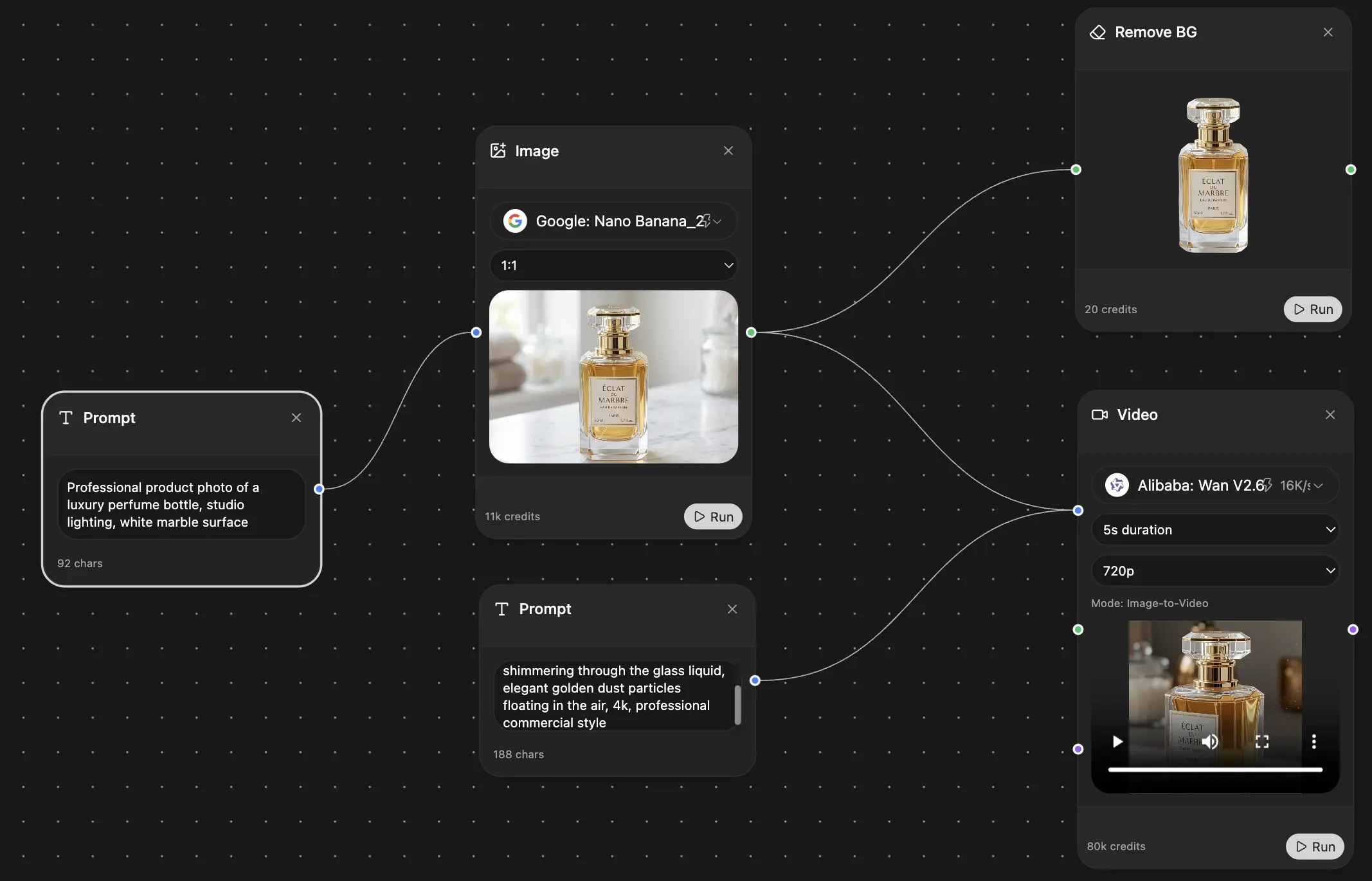
Your infinite AI canvas.
Chat, image, video & motion tools — side by side
Save hours of work and research
Transparent, High-Value Pricing
Trusted by teams at





Free
No credit card required
- 100 credits daily
- 3 AI models to try
- Basic AI chat
Plus
- 1,000,000 credits/month
- 25+ AI models — GPT, Claude, Gemini, Grok & more
- Agent Mode with web search, computer tools and more
- Creative Studio: image generation and video generation
- Project Library: chat with document, website and youtube, podcast generation, flashcards, reports and more
- Workflow Studio and FocusOS
Professional
- Everything in Plus, and:
- 2,100,000 credits/month
- Pro-exclusive models (Claude Opus, Grok 4, Sonar Pro)
- Motion Tools & Max Mode
- First access to latest features
- Access to additional offers
What Our Users Say
Great Tool after 2 months usage
simplyzubair
I love the way multiple tools they integrated in one platform. So far it is going in right dorection adding more tools.
Best in Kind!
barefootmedicine
This is another game-change. have used software that kind of offers similar features, but the quality of the data I'm getting back and the sheer speed of the responses is outstanding. I use this app ...
simply awesome
MarianZ
I just tried it - didnt wanna stay with it, because there is so much like that out there. But it convinced me, because: - the discord-channel is very response and fast - the number of models are quite...
A Surprisingly Comprehensive and Engaging Experience
bruno.battocletti
Zemith is not just another app; it's a surprisingly comprehensive platform that feels like a toolbox filled with unexpected delights. From the moment you launch it, you're greeted with a clean and int...
Great for Document Analysis
yerch82
Just works. Simple to use and great for working with documents and make summaries. Money well spend in my opinion.
Great AI site with lots of features and accessible llm's
sumore
what I find most useful in this site is the organization of the features. it's better that all the other site I have so far and even better than chatgpt themselves.
Excellent Tool
AlphaLeaf
Zemith claims to be an all-in-one platform, and after using it, I can confirm that it lives up to that claim. It not only has all the necessary functions, but the UI is also well-designed and very eas...
A well-rounded platform with solid LLMs, extra functionality
SlothMachine
Hey team Zemith! First off: I don't often write these reviews. I should do better, especially with tools that really put their heart and soul into their platform.
This is the best tool I've ever used. Updates are made almost daily, and the feedback process is very fast.
reu0691
This is the best AI tool I've used so far. Updates are made almost daily, and the feedback process is incredibly fast. Just looking at the changelogs, you can see how consistently the developers have ...